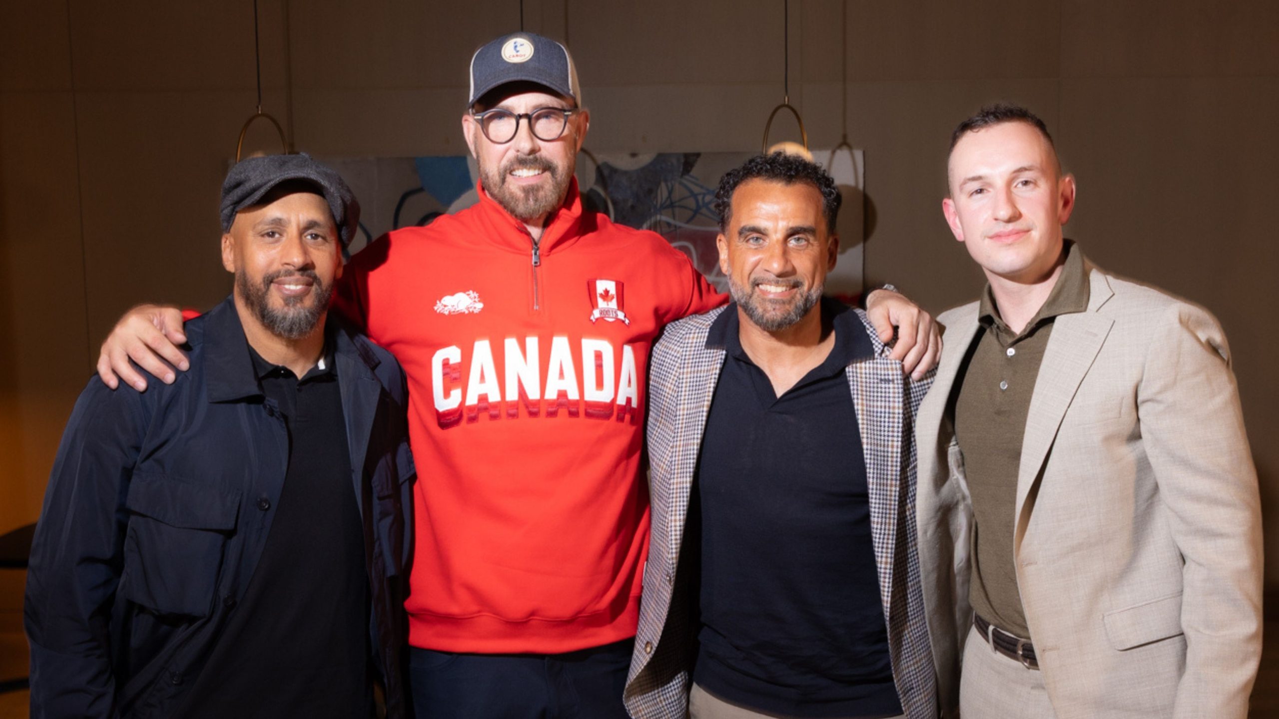
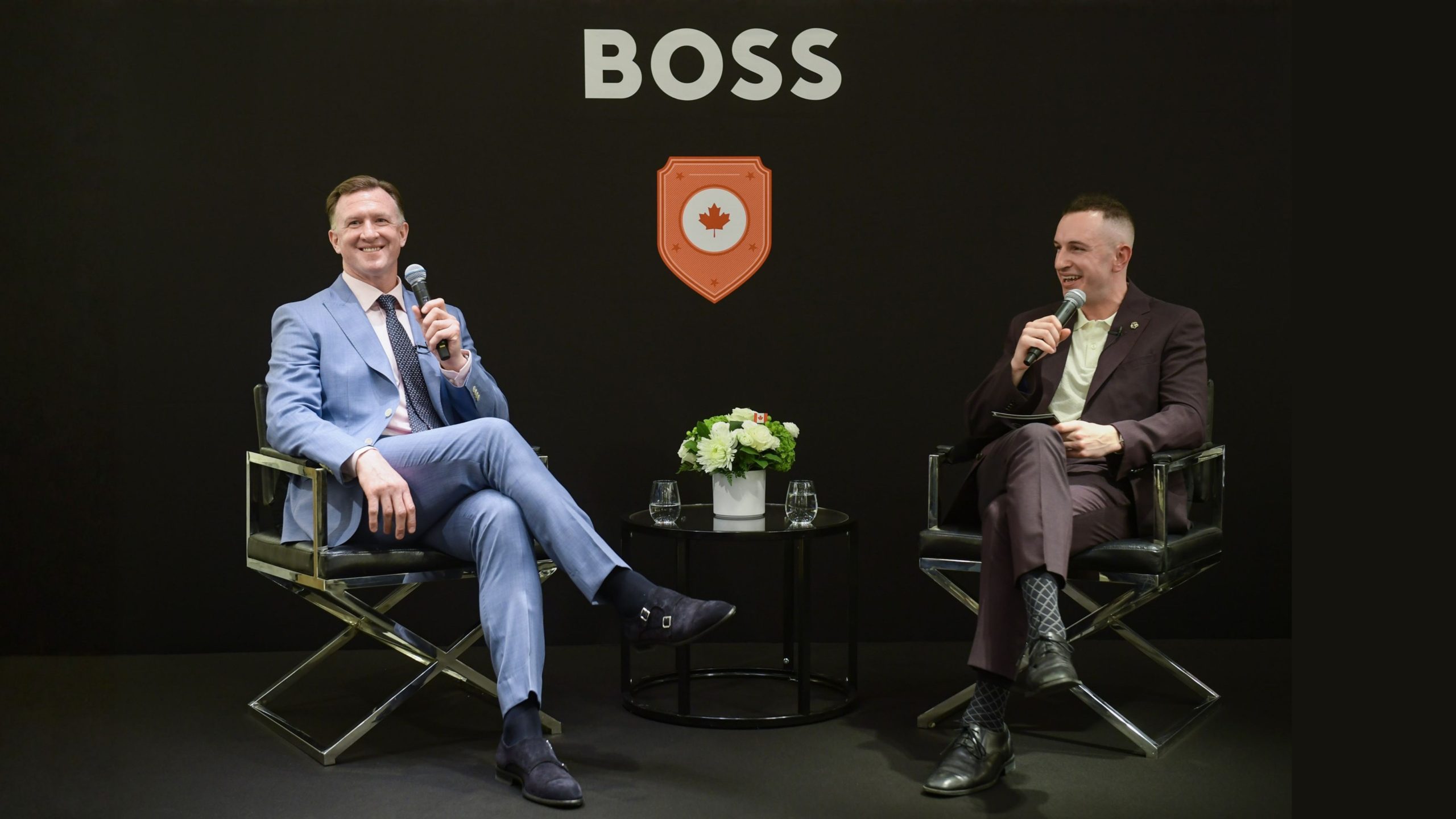
Cartier Turns Its Love Bracelet Into a Prism Again

The Cartier Love bracelet has always been a study in restraint, a clean oval of precious metal tightened with the kind of certainty that feels almost intimate. Now, the house is letting that restraint blush. With six vibrant new interpretations, the Cartier Love bracelet returns in colour, not as a gimmick, but as a fluent extension of the design’s original clarity.

The Cartier Love bracelet, now written in gemstones

There is a particular pleasure in Cartier when it refuses to shout. Even in these new editions, the colour is considered, composed, and unmistakably Cartier. Some versions arrive as full pavé, using pink sapphires, blue sapphires, and vivid green tsavorites that catch the light with a crisp, almost glassy finesse. Others take a subtler route, with softly graduated gemstones replacing the signature screw motifs, turning what used to be graphic punctuation into a gentle chromatic rhythm.

For readers who track jewellery the way others track art fairs, it is worth noting how this shift changes the emotional temperature of the piece. The Love bracelet has always carried a certain modern severity. Gemstones soften it, warm it, and make it feel less like armour and more like celebration.

Rainbow Love bracelet, the collector’s return

Leading the collection is the revival of the coveted Rainbow Love bracelet, discontinued in 2021 and quietly missed ever since. Reimagined with a vivid composition of natural gemstones, it transforms those iconic screws into a calibrated spectrum, each stone chosen for saturation and harmony rather than mere variety. It is the sort of bracelet that makes you look twice in daylight, then again at dinner, when candlelight turns the colours deeper, almost liquid.

Cartier has not positioned this as mass novelty. The release is highly limited, rumoured at just 50 pieces per colour worldwide, which gives the Rainbow Love bracelet the particular electricity collectors recognise immediately, scarcity with a point of view.

Why this colour story feels timely

In a season where so much jewellery leans on volume and noise, Cartier’s move is more elegant. It takes one of the most recognisable silhouettes in modern jewellery and lets colour do the talking, without changing the sentence structure. The result feels culturally aware too. A rainbow is never just decorative anymore, it is a language, and Cartier speaks it here with discipline.

If you are following the wider conversation around high jewellery and design, you might enjoy browsing Fashion, Luxury, and Jewellery on Glory Media, where the line between style and collecting is treated as delightfully porous.

For more on the maison, visit Cartier, and for the original reporting and imagery, see @cartier and GRAZIA Singapore.

Image Credits: GRAZIA Singapore.