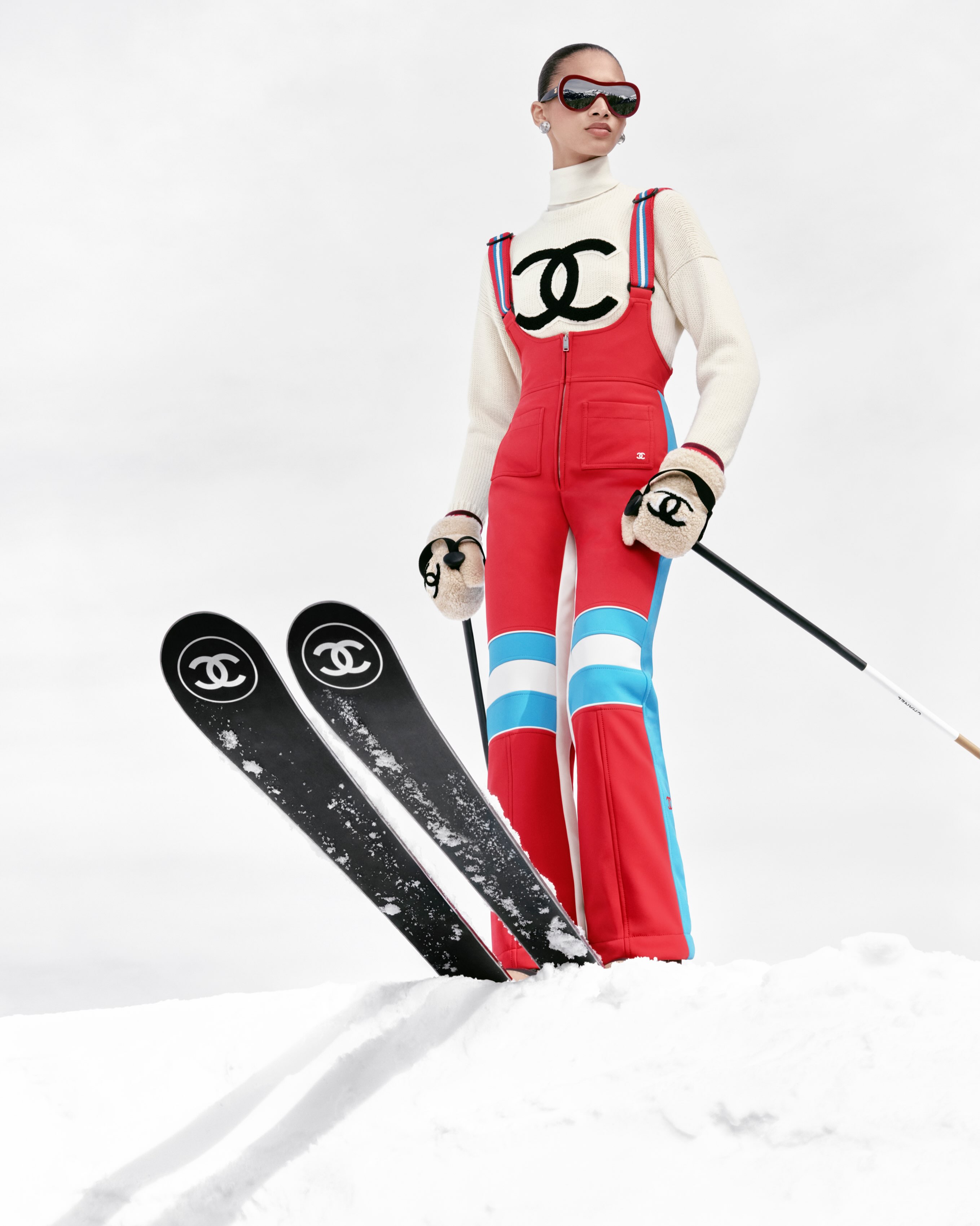

There is a particular thrill in seeing restraint used like a flex, and in 2026, that is the clearest reason to pay attention to Outlander Magazine art direction. While much of culture feels engineered for the scroll, Outlander’s visual decisions ask for something more exacting, the kind of attention you give to a well cut coat or a perfectly lit still life. It is not just pretty, it is paced, and that pacing is the difference between design and taste.
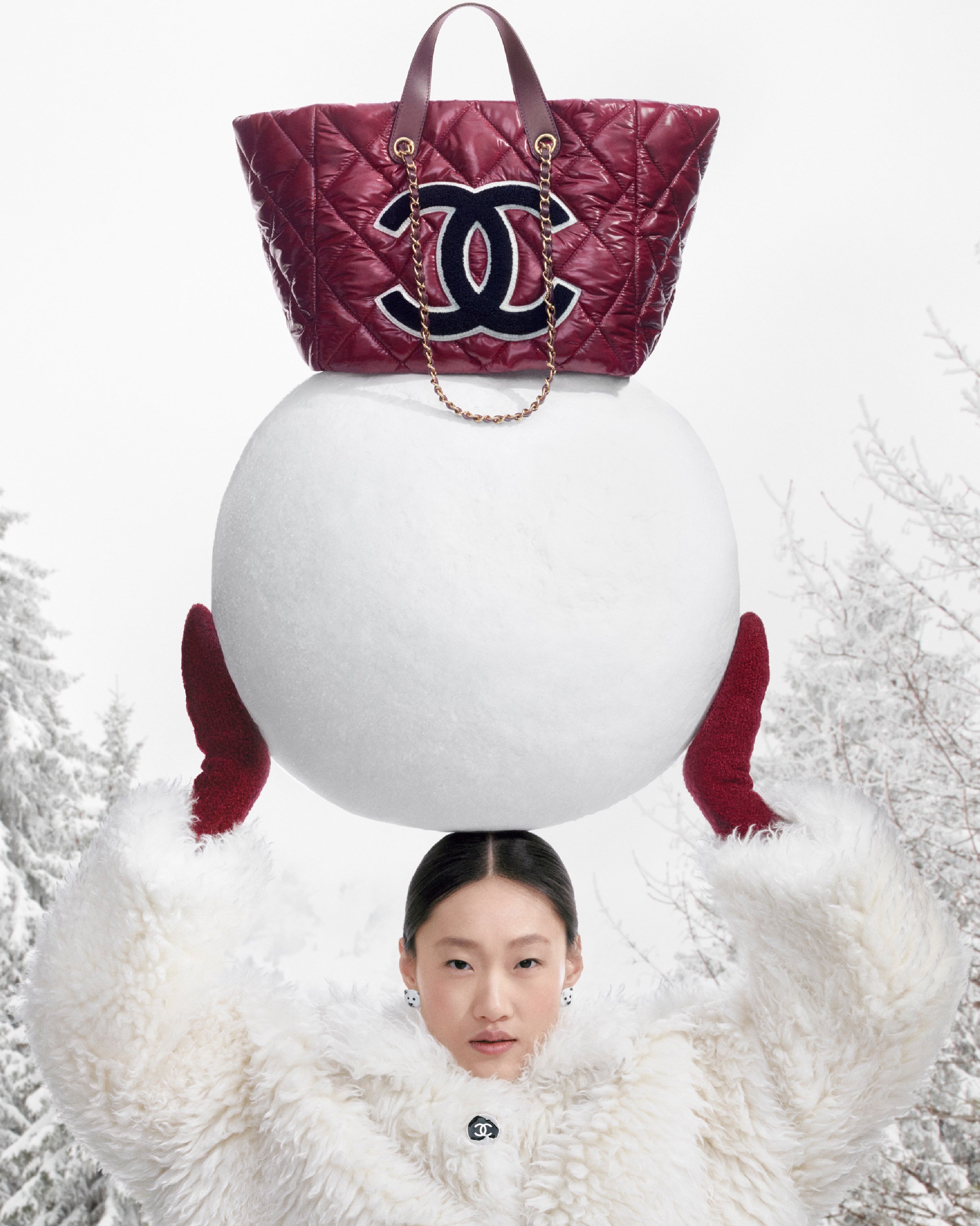
Outlander Magazine art direction, why it lands now
What makes Outlander Magazine art direction feel so satisfying is its confidence in negative space, in typography that does not beg for applause, and in imagery that has been edited, not merely chosen. The layouts feel like someone fought for them, line by line, margin by margin. That is rarely accidental. It is also why the refrain, give the art director a raise, lands not as internet noise but as a real editorial assessment.
It helps to remember what good art direction does at its best, it choreographs desire. It tells you where to look, when to pause, and when to move on. Outlander understands that a photograph can be excellent and still fail a page if the surrounding rhythm is wrong. Here, the rhythm is right.
The pleasure of disciplined typography
Outlander’s type choices feel like they have been lived with. Headings sit with authority rather than volume. Captions do not clutter, they clarify. If you care about the quiet power of editorial design, you will recognise the lineage, somewhere between boutique European fashion biannuals and the cleaner end of contemporary culture publishing.
Image sequencing that respects the reader
Sequencing is where many magazines get lazy, but Outlander treats it like a narrative cut. A close portrait after a wide establishing frame, a dense page followed by air, a single image given full permission to breathe. It reads like someone who understands that the reader is not a metric, the reader is a guest.
If you want a broader context for the current appetite for vintage informed polish, the way Vogue frames Milan’s best vintage stores is a useful parallel, specific, human, and anchored in taste rather than trend.
How Outlander turns atmosphere into identity
There is an almost cinematic attention to surface in Outlander Magazine art direction, matte blacks that feel like charcoal, whites that read as paper rather than screen, and colour used sparingly, like a good fragrance, present, not loud. That atmosphere becomes identity, and identity is what keeps a title from dissolving into content soup.
For readers who come to Glory for style and culture with some spine, this sits naturally alongside our Fashion coverage, our sharper eyed Culture stories, and the objects and rituals of the Luxury world. Outlander’s best pages understand that luxury is often an editorial decision before it is a price tag.
The references feel informed, not performative
You can sense the research, but it is not name checked like a résumé. The influence of classic editorial systems is there, grid discipline, hierarchy, tension, but it is softened by modern intuition, the way you might pair a heritage watch with an intentionally plain shirt. For anyone curious about contemporary editorial craft, it is worth looking at idea forward studio work like Pentagram, not because Outlander imitates it, but because the same seriousness about form is present.
Print grade sensibility in a screen first era
Even when you encounter Outlander digitally, the cues are print. The pages seem designed for paper weight, not just pixels. That choice signals a longer view, the belief that a magazine is not a content channel, it is a world. And if you have ever studied the craft standards celebrated by institutions like the AIGA, you will recognise the old lesson resurfacing, clarity is not minimalism, clarity is care.
Why the raise is deserved, and what it says about culture
So yes, give the art director a raise. Not as a meme, but as a statement about what we want again, editing, point of view, decisions. Outlander Magazine art direction signals that readers are hungry for media that does not feel disposable. It is a reminder that in an era of endless publishing, the rarest commodity is not access, it is discernment.
And perhaps that is the real compliment, Outlander treats you like someone with eyes.
Image credits to the respective owners.